This client, a small CPA firm, was undergoing a change in ownership and needed a new logo and some branding to reflect this shift. Below are two options I developed in detail for the firm.
Option 1: Compass logo. The compass idea conveyed the direction and guidance that these CPAs provide for their clients. While a strong visual element, the client felt the ‘O’ was a bit too obscure and wanted something simpler.
![]()
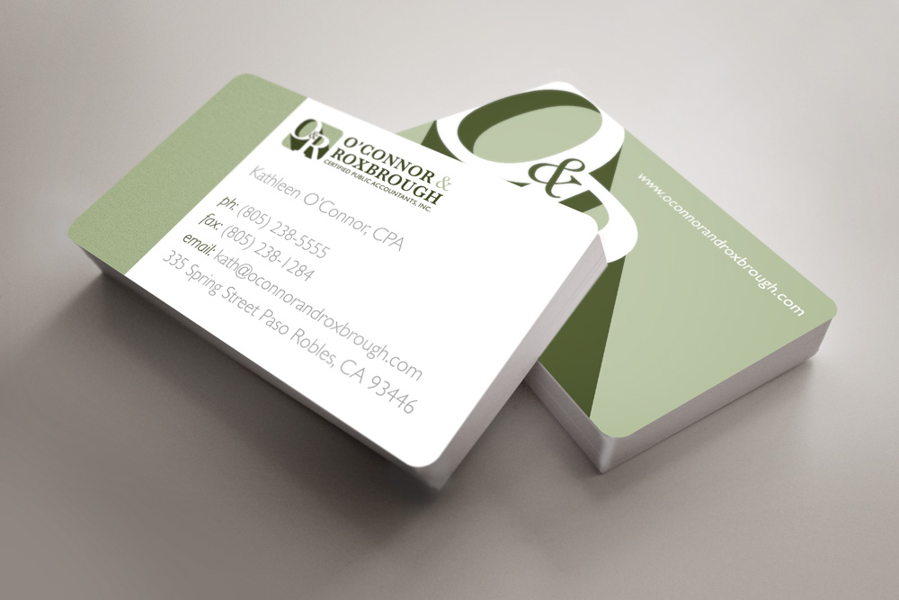
Option 2: Letter logo. Always a strong technique, the two letters of the owners’ last names played nicely together in tones of green.
![]()
They ended up choosing the second version and from there I designed business cards, letterhead and a full brand identity pack for O’Connor & Roxbrough.