This was such a great concept from the start, it was destined to be a success! This logo design was for a legal document preparation services company. We wanted something that represented wisdom fairness, and protection, but we did NOT want it to be confused with attorney services.

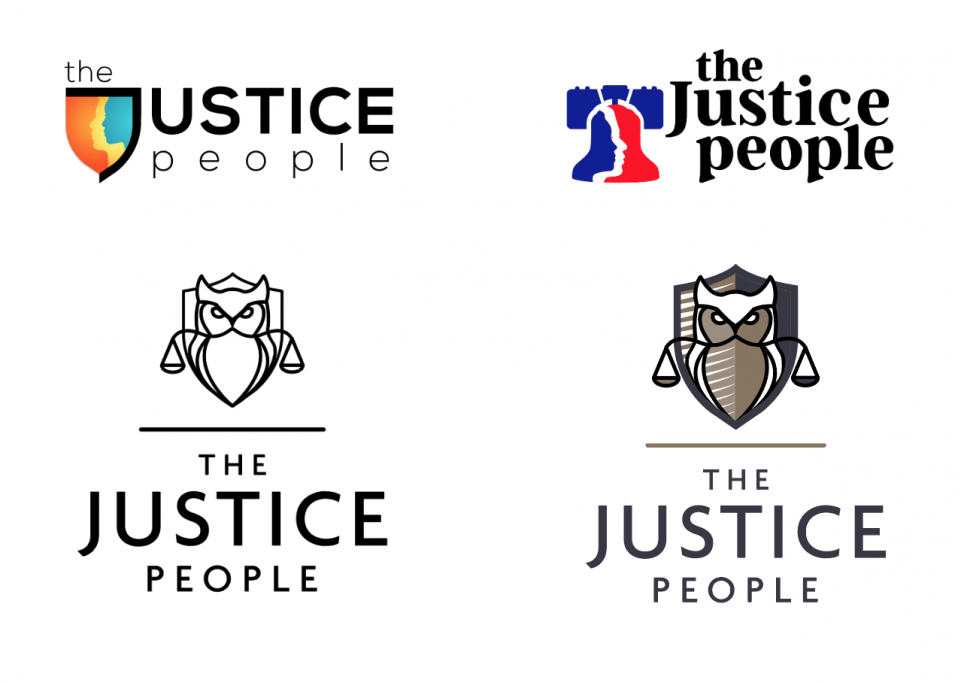
This is an example of a logo design that took more than the usual number of rounds and revisions, BUT we persevered and came up with a solution that the client loved. Here are some of the other iterations I liked along the way:
